Remote Booking
- Oct 18, 2020
- 7 min read
Updated: Jan 18, 2021
Product Design Lead | Phone & Tablet | Evolve a feature
Feature enables users to set recordings on their DVR using their mobile app.

The DIRECTV mobile app (aka TVE) is offered to users who subscribe to the DIRECTV satellite service. They can use the app to stream video or control their set-top box (schedule recordings from anywhere; use the app as a remote control).
A key feature is Remote Booking. This enables users to schedule recordings on their DVR using the mobile app. I led a team that designed this feature for mobile & tablet. We worked with multiple product and development teams from ideation through to implementation.
What is the business ask?
Redesign the existing Remote Booking feature as part of transitioning users to a completely new app.
The DIRECTV mobile app (aka TVE) was dated and running on a patchwork of legacy services that had been sticky-taped together over several years. The business wanted to migrate the app to AT&T's new entertainment framework (aka OV). This would significantly reduce operational costs, improve operational efficiency and make the new framework's capabilities available to TVE. Users would get an app update switching them from the old app to a new app.
How might remote booking look and function in this new app?
Who are we designing for?
Older users using this feature to schedule recordings to watch later on their TV.
DIRECTV users skew older and watch a lot of live and pre-recorded programs. Their main viewing device is the TV. These users are predominantly cable/satellite users and under-index on their use of streaming services.
A significant portion primarily watch pre-recorded content. These users are more likely to watch scripted content and tend to be selective and intentional about what they watch. They greatly value the convenience and control that recording content to watch later provides.
What do we know?
Remote Booking is an important but secondary feature used mostly to set episode and series recordings.
App Usage Data

Usage data shows that streaming is by far the most used feature on the app. Setting a recording is the second most used feature and has consistent usage but is a much smaller set of users than streaming.
1-way communication with DVR
Confirmation consists of message sent to the DVR, not message received by the DVR.
Once a user schedules a recording, they cannot cancel it via app, cancel on DVR only. Users can schedule the recording again and the new request will override the old one.
Exception: If the set-top box is broadband connected, it can send a recording scheduled pass/fail message back to the app (not MVP)
How many recordings are set?
Approx. 1.5 million recordings are set each month. The average number of feature users is ~500k. This indicates the average user is setting more than 1 recording a month (data not tracking exact usage).

What are users recording?
Single episodes are the most common recording that is set. An average of ~500k episode recordings are set each month.
Recording experience on current DIRECTV Mobile app (aka TVE)
When Record CTA is tapped, current experience displays all available recording options without context.

Off-the-shelf recording experience on new framework (aka OV)
There is an existing record experience with basic functionality built for a cloud DVR feature.

Design Ask & Goals
Create a remote booking experience that balances the new framework and existing behaviors.
Design Ask
How might we simplify the remote booking experience for DIRECTV Mobile app users on the new framework while minimizing new behaviors they need to learn?
Design Goals
Identify the core functionality users need to successfully schedule a remote booking
Modify the OV experience to cater to the needs of the user while minimizing deltas
Streamline the remote booking experience on OV for users
Primary Tasks
Users should be able to
record a series
record an episode
record an individual program
edit record options (prior to scheduling a recording)
select from different sources (channel, airing date, VOD)
record to different receivers (if applicable)
pivot from an episode recording to a series recording
Design Directions
Explored three directions on a spectrum - from matching current behavior to closest to the new framework.
We mapped out a set of high-level concept explorations. These lay along a spectrum from those closest to the existing DIRECTV Mobile app (most familiar to the user) to those closest to OV (much closer to what their overall app experience would be in the new framework).


After an initial set of flows, we narrowed these down to 3 directions that could be good solutions to fulfill the primary tasks and deliver on the design ask and goals.

TVE Focused
Keep existing experience as-is in the new framework.

This is the existing experience for TVE users with UI patterns from the new framework. Tapping “Record” displays recording options and prompts the user to confirm the recording.
Pros
Meets TVE users’ expectations
Cons
Forces users to view options even when there is no intent to adjust
Recording a currently airing program from the video player (aka Hot Record) behavior is not elegant
Top Level Integration
Merge the existing experience with the new framework.

This allows "Record" to keep the behavior currently available in the new framework. "Record" and "Record Options" are at the same level. Tap "Record Options" to display and edit recording options. Tapping "Record" does not display options and moves directly to confirming the recording request.
Pros
If user elects not to edit options, their record flow is streamlined to OV style
Cons
User could schedule recording without realizing the need to adjust options
Option Based
Translate the existing experience in the new framework.

This modifies the current behavior used in the new framework to a behavior that TVE users are likely to be more familiar with. Tap "Record" to display a modal. The modal allows the user to edit their recording options or confirm the recording.
Pros
Ability to edit options is displayed without having to list the options themselves
Re-uses current OV patterns
Familiarizes TVE users with OV patterns
Cons
New pattern for current TVE users
Evaluating the design directions
Decided on "Option Based" as the final design direction
For each direction, we flowed out what the experience would look like for the primary tasks.

Then, we did a deeper dive into into how each direction handled the record episode and record series flows.

We also ran an exercise evaluating different aspects of how each direction handled the "record episode" flow since that was the common type of recording set.

Finally, we took a look at how each direction measured up against the design ask and goals. Of the three concepts, the Option Based direction struck the right balance of
displaying contextual options if the user wanted to use them
presenting an experience that was new but still familiar to existing TVE users
modifying the existing OV patterns while still minimizing deltas
Final Design
Detailed design of the 3 core screens used in the "Option Based" design
With Option Based as the chosen direction, we started working through the granular details of the design. There are 3 main screens the feature uses. All recording tasks use these 3 screens. The info displayed on each screen is contextual to the specific recording task.
Summary Modal
Displayed when the Record CTA is tapped on the Info screen.
Iterations on how to "Edit Options" from the Summary Modal

Iterations on how to display recording info in the Summary Modal


From these iterations and more, we narrowed down to a style that we thought did well at presenting the recording info and making it clear that it could be edited. A key decision we made here was to to treat the modal as a single unit that could be edited rather than individual blocks to edit.

As we worked through the details, we incorporated an idea from one of the other directions we had tried. This was to display only the essential information needed to schedule a recording (what am I recording, on what channel and when). To modify their recording request, a user could choose to edit and see all options available in the Options Modal.

As part of this approach, we also went back to the data to see how many users had more than 1 DVR on their account. Less than 20% of users had more than 1 DVR. So, we decided to split the pattern - use headers for users with multiple DVRs (can select which one to record on) and a simpler pattern for the 80% case.
Final Design of Summary Modal

Options Modal
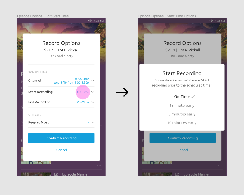
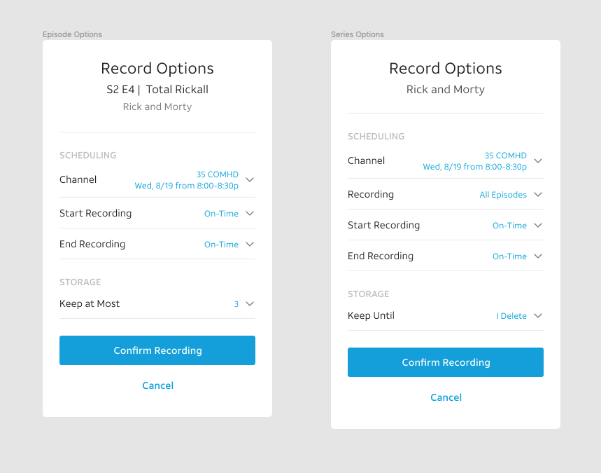
Displays if a user taps the Record Options CTA in the Summary Modal. this modal displays all recording available for the current program. We grouped these options into the recording aspect they affected -
Scheduling: When is this recording, What is the recording duration
Storage: Where is this recording stored, How long do you want to keep it

Iterations on the Options Modal


If a user chose to edit an option, their updated choice would be reflected here before they confirmed their recording.
Final Design of Options Modal

Confirmation Modal
Displayed if the user selected the Confirm Recording CTA from the Summary Modal or the Options Modal. This modal displayed the recording request sent to the set-top box. The modal auto-dismissed and users would be back on the screen with the Record CTA.
Iterations on info displayed in the Confirmation Modal


The decisions we made in the Summary Modal were reflected here too - simplifying to essential info (don't show the option unless the user edited it).
Final Design of Confirmation Modal

Final Design Flows
Record Episode Flow

Record Series Flow

Testing
Feedback was unanimously positive from all users.
We validated the final design with existing TVE users. We built a prototype that was put into testing with these users walking through the core tasks of recording an episode, recording a series and recording the program they were currently watching.
The feedback was unanimously positive from all users.
What did I learn?
Process always helps. Always.
There was a temptation to go with the safe option. i.e. to recreate the existing TVE experience in the new framework. Users were already familiar with this pattern; there were no major complaints about it; the app change was being drive more by a business need than a user need; it's what stakeholders expected to see...why rock the boat? I am happy we did. Our final design did a better job of addressing the user need and simplifying the experience. But it was not a happy accident. The design process uncovered the opportunity and we took it. It would have been easy to dispense with process on this project and jump straight to execution. And the design would have been poorer for it.


Comments